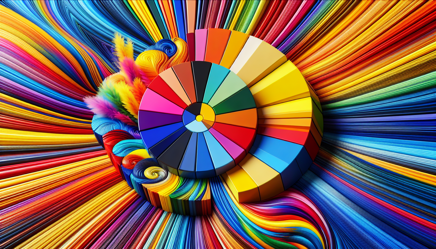
Color plays a crucial role in design, wielding the power to evoke emotions, convey messages, and capture the essence of an era. As we approach 2024, a new wave of bold and vibrant palettes is redefining the visual landscape in modern graphic design. These audacious color combinations are not just catching the eye but are also setting new standards for creativity and innovation in the industry.
One of the starring trends is the embrace of neon and electric hues. These colors are not merely bright—they're luminous, with an almost digital intensity that speaks to our increasingly technology-driven world. Designers are opting for electric blues, radiant purples, and vivid pinks, creating designs that pulse with life and energy. This neon renaissance offers a nod to the retro while looking towards the future, creating a sense of timeless modernity.
Complementing these electric tones are rich, saturated shades that add depth and sophistication. Think luxurious emerald greens, velvety deep reds, and sumptuous golden yellows. These colors provide a sense of weight and gravitas, balancing the vibrancy of neon shades with elegance and maturity. By combining electric and rich hues, designers are crafting palettes that are both dynamic and grounded, a reflection of the complex world we live in.
Moreover, the trend of using clashing colors—hues that traditionally wouldn't pair together—is gaining traction. These bold, unexpected combinations invite viewers to engage with designs that challenge conventional aesthetics. By juxtaposing colors like vivid tangerine with deep teal, or fuchsia with olive green, designers create a visual tension that captivates and intrigues. This approach not only makes a strong statement but also highlights the importance of individuality and breaking norms.
In addition to bold pairings, the resurgence of gradients offers an additional layer of creativity. Gradients in 2024 are far from subtle; they demand attention and celebrate transitions. Designers are using them to create smooth shifts between vibrant colors, adding movement and flow to static images. This technique is particularly impactful in digital spaces, where transitions can mimic the dynamic, ever-changing nature of the digital world.
Pairing these bold palettes with minimalist designs is another emerging trend, where color takes center stage. By simplifying forms and structures, designers allow color to become the primary focus, creating a raw yet polished aesthetic. This juxtaposition between simplicity and intensity further amplifies the power of color, demonstrating its potential to communicate without relying on complex forms.
Finally, the use of bold palettes reflects a broader cultural emphasis on inclusivity and diversity. As society becomes more aware and accepting of various identities and experiences, design follows suit. Bold and varied color palettes symbolize a celebration of diversity, inviting a wider audience to identify with and enjoy visual narratives.
In conclusion, the bold palettes of 2024 signify more than just a change in aesthetic preference—they represent a cultural shift towards embracing vibrancy, individuality, and diversity. These colors challenge designers to push boundaries and create work that speaks to the heart of modernity, capturing the spirit of an era that values connectivity, creativity, and bold expression. As these palettes set the stage for the future of graphic design, they continue to inspire and engage, inviting us all to see the world through brighter, bolder lenses.